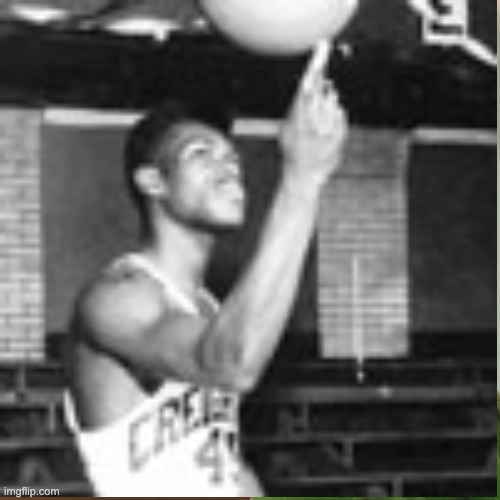
The Best Uniforms in College Basketball Belong to...
16 posts
• Page 2 of 2 • 1, 2
Re: The Best Uniforms in College Basketball Belong to...
Our template is pathetic for a team that could do so much awesome stuff with black/white/grey. That thick black bar down the sides of our greys and whites (and inversely the thick grey bar down the sides of the blacks) is absolutely horrendous.
- Friarsfan94
- Posts: 207
- Joined: Wed May 17, 2017 10:55 am
Re: The Best Uniforms in College Basketball Belong to...
Friarsfan94 wrote:Our template is pathetic for a team that could do so much awesome stuff with black/white/grey. That thick black bar down the sides of our greys and whites (and inversely the thick grey bar down the sides of the blacks) is absolutely horrendous.
+100000%
I've pleaded with Bob Bob Driscoll too many times over the years begging him to change the look. I've finally given up. They clearly just don't care about their look or what their fans actually want.
- FenwayFriar
- Posts: 338
- Joined: Thu Dec 24, 2015 12:18 pm
Re: The Best Uniforms in College Basketball Belong to...
How bout some legendary jerseys:
1. Georgetown with Patrick Ewing inventing the T-Shirt under the grey jersey
2. Marquette 1977 with the Warriors under the numbers
3. Kemba and the new UCONN logo jerseys
4. Classic navy Nova with Massamino in ‘85
5. DePaul with Ray Meyer and the colored rectangles up the side
1. Georgetown with Patrick Ewing inventing the T-Shirt under the grey jersey
2. Marquette 1977 with the Warriors under the numbers
3. Kemba and the new UCONN logo jerseys
4. Classic navy Nova with Massamino in ‘85
5. DePaul with Ray Meyer and the colored rectangles up the side
-

Django - Posts: 1054
- Joined: Sat Dec 29, 2018 5:48 pm
Re: The Best Uniforms in College Basketball Belong to...
FenwayFriar wrote:Friarsfan94 wrote:Our template is pathetic for a team that could do so much awesome stuff with black/white/grey. That thick black bar down the sides of our greys and whites (and inversely the thick grey bar down the sides of the blacks) is absolutely horrendous.
+100000%
I've pleaded with Bob Bob Driscoll too many times over the years begging him to change the look. I've finally given up. They clearly just don't care about their look or what their fans actually want.
I realize this stuff does not matter, but from a pure marketing standpoint, it’s absolutely mind-boggling that we’re still wearing these things after the reception the throwback alternate template received last season. They created way more buzz than a team wearing a certain uniform should create, and that is because of how disgusting our currents are. It is pure, ignorant, incompetence on the athletic department’s part to not realize that something so simple, and completely in their control, could please so many of their fans.
- Friarsfan94
- Posts: 207
- Joined: Wed May 17, 2017 10:55 am
Re: The Best Uniforms in College Basketball Belong to...
That’s what I say to Friar fans complaining about their jerseys... they have some of the coolest in all of college hoops.
You want to see ugly uniforms look at the history of the Jays, current backwards-striped blue Jay feather down the sides included!
I’d like to see us back in those Bob Gibson whites with the belt included! Now that’s class.
-

Django - Posts: 1054
- Joined: Sat Dec 29, 2018 5:48 pm
Re: The Best Uniforms in College Basketball Belong to...
Outside of UCONN, my hands down favorite is Marquette.
-

Husky_U - Posts: 934
- Joined: Sun Jun 23, 2019 5:26 pm
16 posts
• Page 2 of 2 • 1, 2
Return to Big East basketball message board
Who is online
Users browsing this forum: No registered users and 23 guests
